1. Preliminary testing
Since we’re drawing for use at 9 points – and before we even dwelve on proportions –, I run some tests to know how much thin the stroke modulation could be.
In very simple terms, it consists in a typeface where each glyph contains a vertical and a horizontal straight lines, as well as a circle, while the stroke width varying 5/1000 UPM, incrementally.
If you wish to perform testing of own, here’s the PDF with this applied to 9 point type.
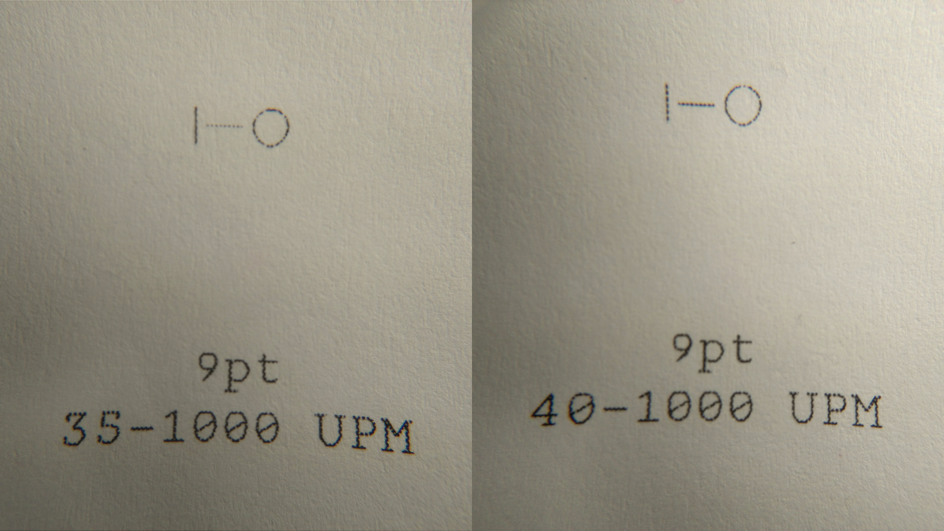
Testing thicknesses at 9 UPM: laser print at 600 dpi, magnified.
What this shows is that the modulation can barely go under 35/1000 UPM, with the printer’s rasterizer barely dealing with it, even with hinting applied.
2. Hello Vertical Proportions
With the minimum stroke with figured out, I moved on to the vertical proportions: especially the relationship between the x-height, ascenders and descenders. At this point, I’m not even concerned about capital’s size, for two reasons:
- Rúben, in his PhD, insisted especially in the capitals and, in spite of him having a lot of work done in the roman and italics (uppercase and lowercase), I’m choosing to ignore the work he has done altogether, due to its revival nature.
- Capital size is an in-between aspect, so we’ll get to that when we actually start drawing capitals: the uppercase forms are relatively of sparse use in text, so it’s impact in the overal texture is not that determinant. Again, the lowercase dictates, in our case, most of the proportions.
For solving this, without getting carried away in designing the lowercase letters, another test follows – and a very simple one: using Just Another Foundry‘s Just Another Test Text Generator, five sets of three glyphs, each set with a different x-height (between 400/1000 and 500/1000 UPM) we used in five random texts, with a leading of 1.2em:
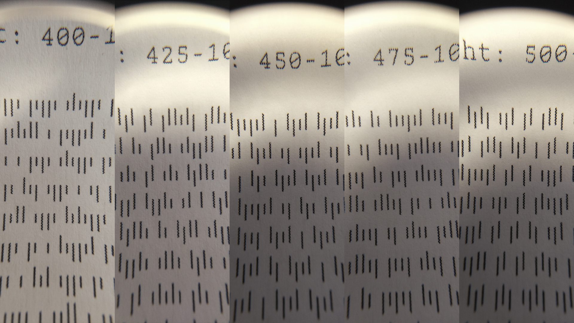
Test of several x-heights at 9pt, with fixed relative ascender and descender proportions. The x-height sizes here are 400, 425, 450, 475 and 500/1000 UPM.
There’s not much of a point to look at this image to try to figure out how the texture will render: again, this is a size-specific design, so you might get better served if you print this out and see by yourself.
But the conclusion here is that the two extremes (400/1000 and 500/1000 UPM) are of no use; the first too dwarfed, the last with too little variation in proportion. To my eye, something between 425/1000 and 450/1000 UPM (and leaning more to 450/1000 UPM, to have a bit more room to let the counters make their statement) is fine.
Still, I have to fight this through with Rúben, as well as test this in a more lettery context, so this test serves as an initial reference, as well as a way to minimize options in an early stage.
3. Ending Notes
There are other ways to solve this, while keeping more options open, sure. One can use interpolation masters for any of these parameters (modulation amount, x-height, ascenders and descenders), but it seems too cluttery for this project.
The goal here is to produce a working prototype as soon as possible, and for a very specific context, as I mentioned in the last article; so, every educated choice I can make now that will save experimentation time down the road, the better.
Until next time.