1. Looking at Specimens
Although this is not a revival, there’s a constant exercise of looking at Villeneuve’s work in order to try to capture it’s main traits. The idea is to borrow concepts more than formal attributes, vibe above form.
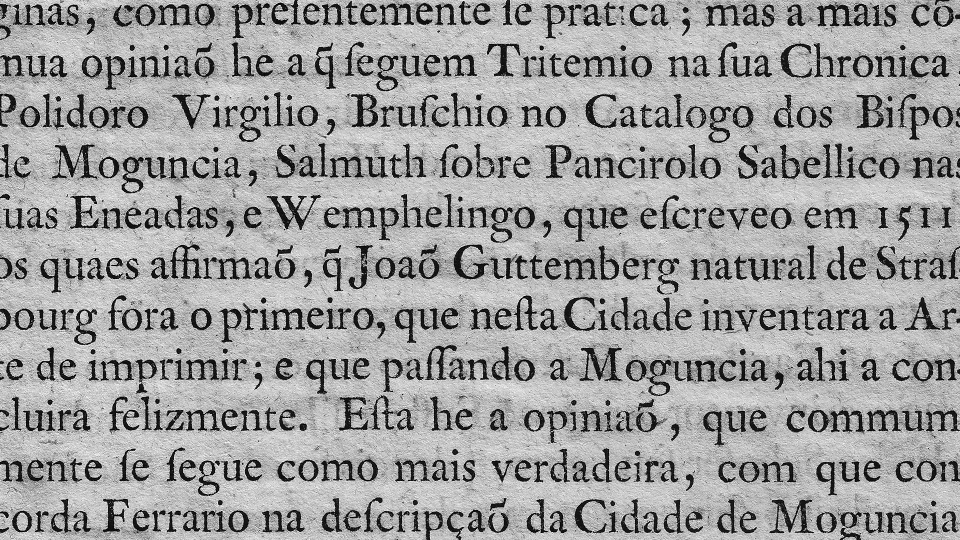
So, one of the first things I did was to print a poster with a page of a book and hang it on the wall of my bedroom, so it could influence me in a sort of unconscious way. I look at it often, trying to capture the texture – I rarely check it for details.
But since we are going through an exercise of finding a rationale behind Regem, today we’ll talk about the flow of the texture, focusing on the horizontal rhythm, especially on the vertical stems.
For starters, consider the image below:
Villeneuve’s Petit Cannon printed – a very subtle forward slant is one of the main traits of the vertical rhythm, along with the flaring and counters invading the stem.
On a quick glance, the typeface has a slightly forward slant (although the angles vary a lot, both typical of hand-cut metal type), vertical stems flare to the extremities (also rather inconsistently) and counters very often invade the stem.
So we’ll go through these three main aspects, analysing them and trying to find a common solution to them all.
2. Slant
As said before, Villeneuve’s types have a notorious (though subtle) slant to the roman. This subtlety still preserves the upright feel of the stems, but the asymmetry of the modulation, combined with the natural slanting of a hand-cut metal types make the texture lively and animated.
Still, for contemporary uses – which involves a lot of rasterizers, even for print – making a slightly slanted roman won’t come without it’s issues, especially due to hinting; adding to this, a constant variation of stem angles would render the texture too funky for screen use, and it would also force us to do several versions of each glyph that would span through several stylistic sets (even pseudo randomizing the variations).
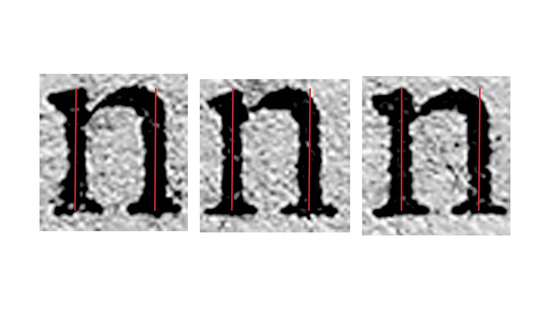
Slant angles of three random n’s. Although very subtle, the characters seem to consistently lean forward.
While talking to Rúben about this, the idea of several stylistic sets did not go off the table; still, this liveliness should exist in a off-the-shelf use, without aditional setting to of features on the user side.
3. Flaring
Hand cut metal type always features flared strokes: it’s a natural effect of our own physical limitations, no matter how skilled the craftmanship. On top of this, irregularities on ink, paper, metal and pressure add to this phenomenon.
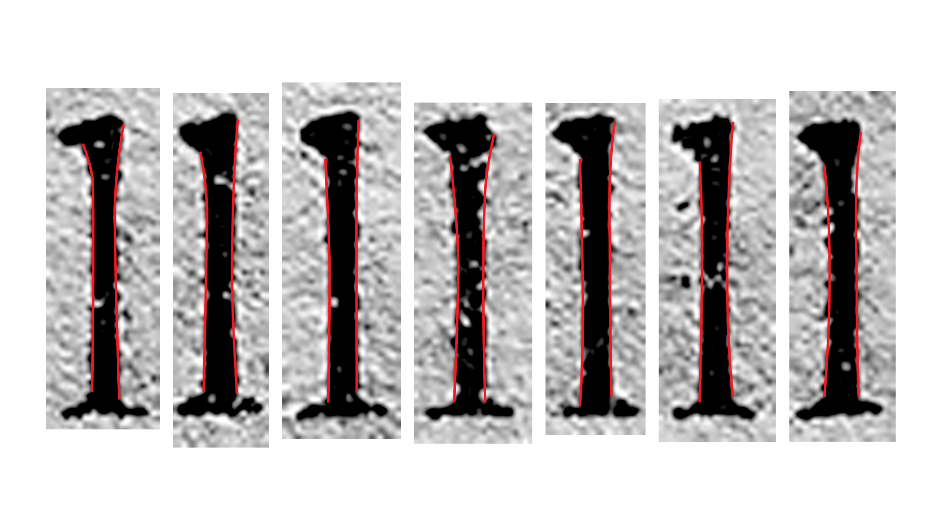
Flaring in several lowercase l’s.
As we’re aiming for a reinterpretation, as we stated before, looking at “errors” and artifacts as features makes it important to consider this flaring.
But back at looking at the specimens: while comparing the slant against the flaring, there are two curious aspects that seem to happen consistently; one is that ascenders (and some descenders) seem to slant mostly backwards and the flaring’s assymetry seem to reinforce the slant, as some sort of tromp l’oeil.
In other words, even when the stems angle leans backward, the flaring makes it appear as leaning forward.
4. Solutions
So, there are some problems to tackle:
- The basic glyph set has to retain the liveliness of the original off-the-shelf, without resorting to alternate characters (depending too much on them, for webfonts or not-so-savvy users would be a disaster);
- Rasterizers aren’t very friendly when it comes to very subtle slants (we should avoid blurry type);
- Flaring varies a lot between glyphs (even in the same letter), so should normalize the way flaring works in our version (because not doing so would produce a very odd-looking [read distracting] typeface);
They way to tackle this is to make use of that flaring trom l’oeil; by keeping one side vertical and the other flared, we can add movement to the vertical rhythm of the texture, without compromising the rasterizer as much.
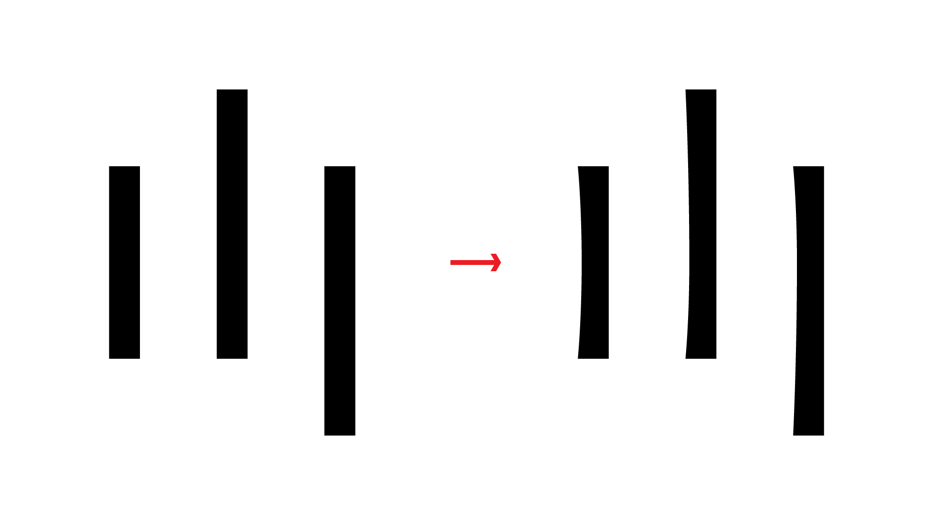
Left: straight stems; Right: Stems concave on the left side.
Consciously or not, Villeneuve seems to be doing this push forward effect by adding mass as one gets away from the center of the x-height.
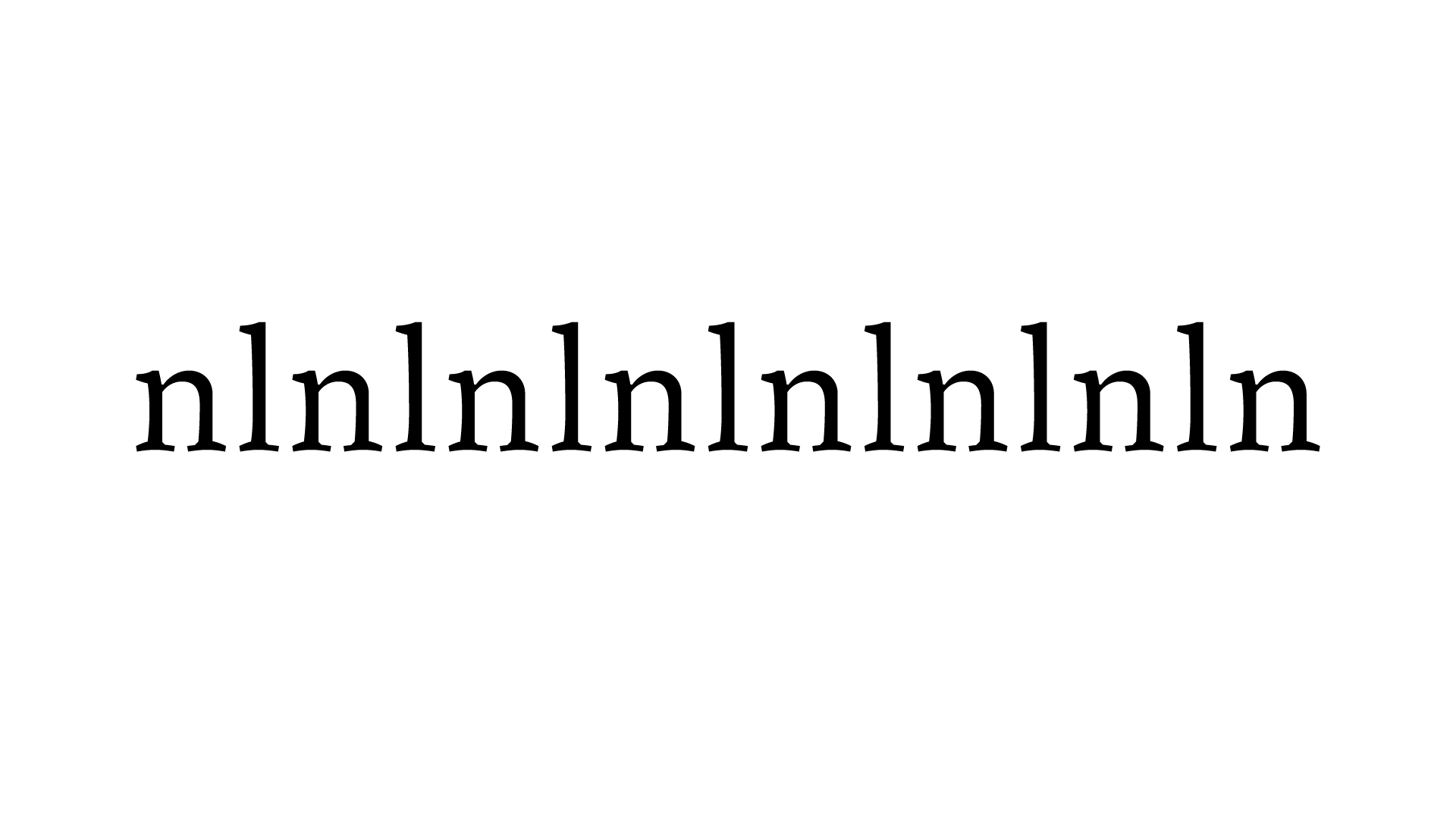
The glyphs n and l in our current version juxtaposed. Notice the push forward feel of the vertical rhythm.
This is one of the things that baffles me more with type design: everytime you dissect a 300 years-old piece and find how brilliant something is, you realize you’re following the footsteps for giantes. Silent giants.
Hope you enjoyed this one.