0. Introduction
Right at the start of this project, one of the first things I did was to make a poster of one of Villeneuve’s prints, set in his Texto, and hang it on my bedroom’s wall.
The goal with this was to subconsciously record the texture in my mind, trying to make them natural to me through constant exposure.
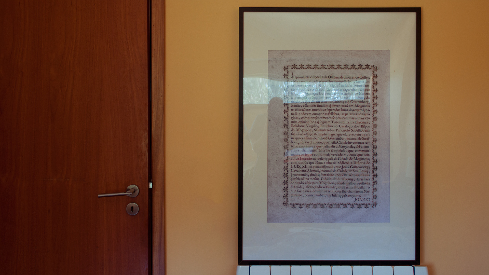
The poster, before it went to the wall.
As mentioned before, we were never aiming for a revival, so the idea of copiously comparing prints and neo-platonically overimposing them to find their “villeneuveness” didn’t seem to be the path we wanted to go. Instead, we want the typeface’s texture to feel Villeneuve-ish. Hence the poster: it contaminates my imagination, but there’s free reign for it to go its own way.
But if you are thinking this is a hypno-magical thing, I garantee you that it involves a lot of staring and a lot of thinking. The thought process itself is highly selective also: I stare at it and try to find commonalities, traits, quirks, looking constantly to balance the hommage with a contemporary approach to it.
1. The Final Result is Print
From the beggining, it was clear to me that I should limit my sources a lot. Since Rúben spent years on his PhD looking, researching and thinking about Villeneuve’s work (and I think it is safe to say that he is the authority in this subject), I had to be the ignorant one: he knows too much, so I have to know too little to balance it out.
If we are going to make a contemporary interpretation of this, someone has to do it with a fresh mind for the typeface to take a life of its own.
So, in this limiting, I took one print. One. A facsimile of a book page, printed by Villeneuve. No metal types, no smoke proofs, no digging for matrices, nothing. Just a page.
And this might sound extreme, but there’s a logic behind it: the typeface itself, the way it really is, formally, is in its final form; printed. Also, I discarded smoke prints for a similar reason: the form is in Villeneuve’s time, with crappy paper, crappy technology (in relative terms, of course). In this way, we are trying to avoid a sterile-looking typeface.
2. Printed Artifacts, Digital Features
The degree of finesse of nowadays type production and printing is eons away from the 1700s; so, the printed specimens we have from Villeneuve’s work – and especially the smaller sizes – are filled with blotches, deformations due to paper texture, unprecise counters depending on pressure and so on.
So, why not to take these artifacts and use them as features? For example, Villeneuve was pretty consistent with transitioning smoothly from thick to thins, creating triangular shapes. Have a look:
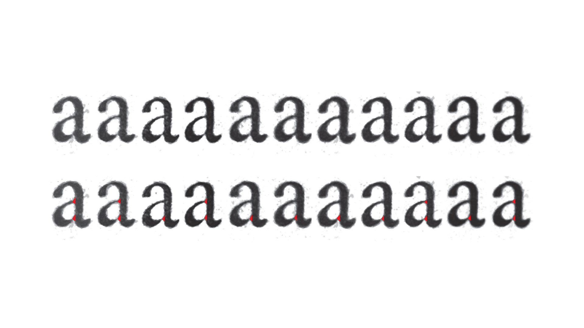
A quick analisys of flaring in the intersections.
Also, pay attention to the bottom part of the a‘s in the image above: there’s a sharp wedge in the bowl-to-the-stem shape, reinforcing the triangular transition.
Now, Villeneuve might have done this unwillingly, though it’s so consistent that I hardly believe it to be unconscious.
Still, we decided to incorporate these oddities in our drawing, subtly influencing the texture. Here’s the digital version of the a (so far):
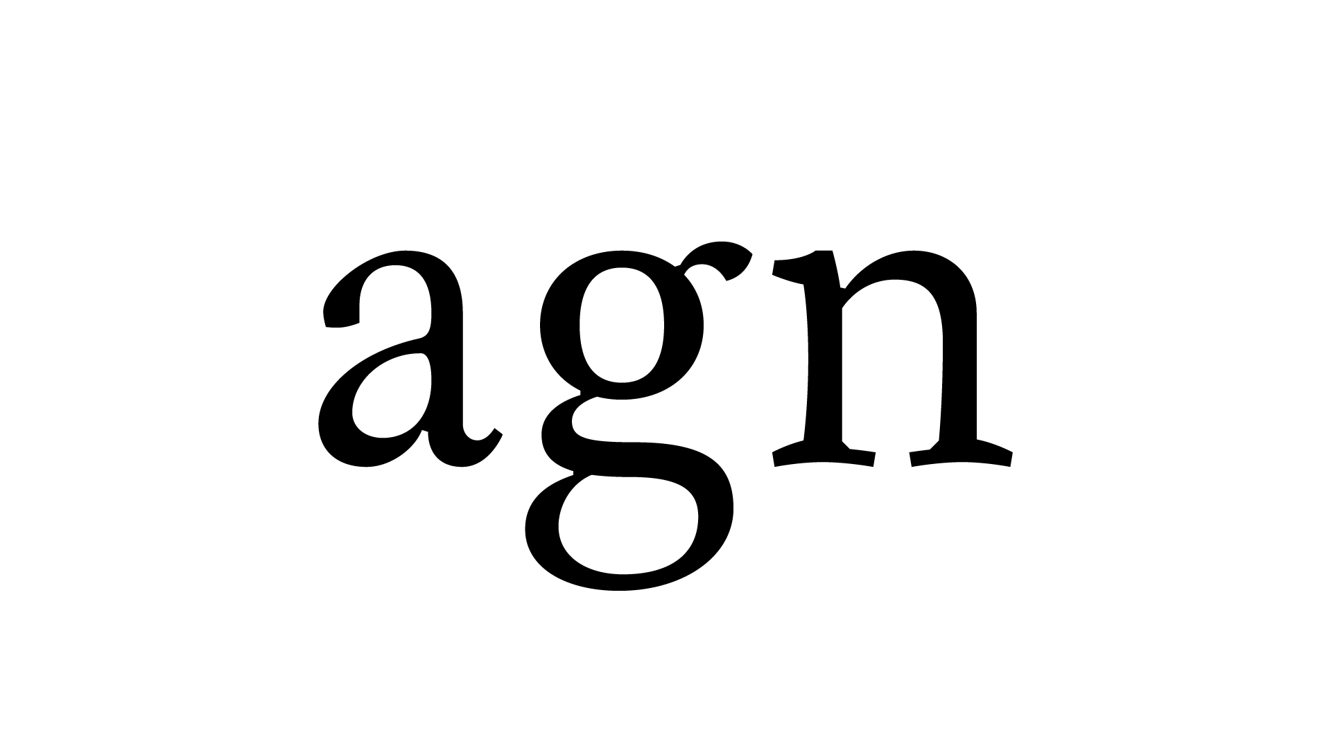
Our digitisation of the roman letters a, g and n.
Hold on: you guys tapered where inktraps should be? That will increase the amount of ink spreading in those spots! – Yeah. Exactly. But that’s a subject for another time.
3. Wrapping up
I hope you enjoyed this article, a bit more on the story behind how we go about the thought process of developing this typeface. See you soon!