As Fábio mentioned in the previous post, Villeneuve’s characters revels a modest slant, obtained by modestly flared stems.
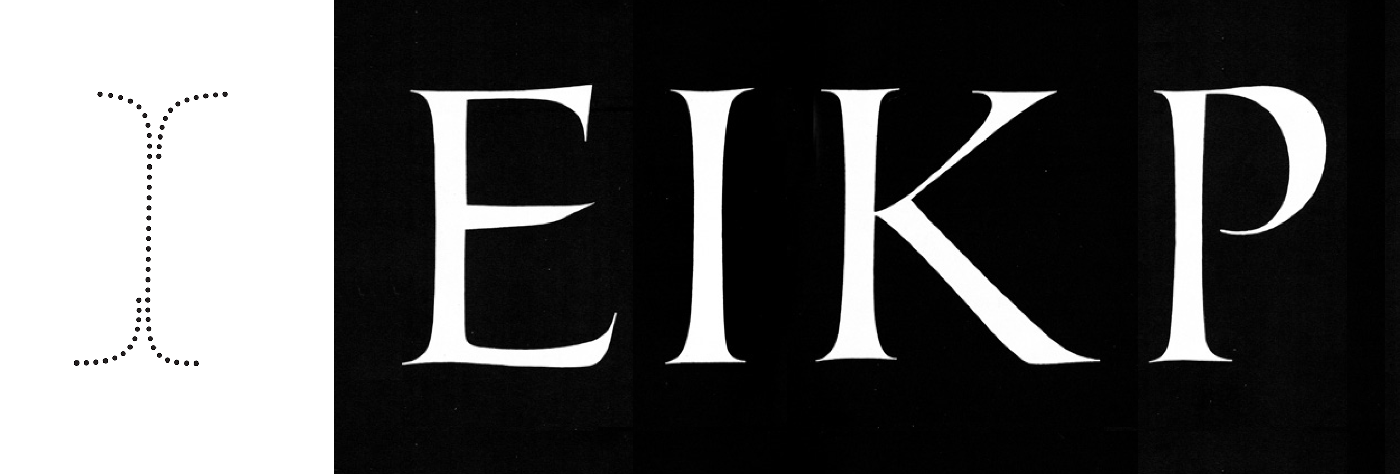
In my PhD studies I realised that Vileneuve’s uppercase display types have another feature that contributes to the the same forward movement: assymmetric serifs.
1. Caligraphic origins
Although not the most common feature, asymmetric serifs aren’t quite a new idea. Its origins came, unsurprisingly, from the calligraphic gesture. From the roman imperial models to humanist calligraphy, these gestures contribute to an apparent irregularity, conveying a more human flavour to the letters.
Left: Formal Roman Imperial strokes gesture. Note the longest serifs are at opposite ends. Right: Roman model with asymmetric serifs. (adapted from Arthur Baker)
Emphasising the Roman calligraphy gesture, Villeneuve’s glyphs have a left foot serif that is longer than the right, while the opposite happens on the top serifs. This detail also contributes to the perceptual effect of a very modest forward slant.
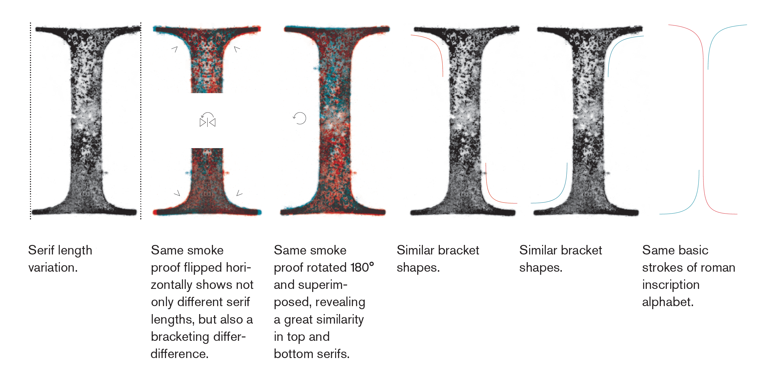
Asymmetrical serifs compared from smoke proofs of Villeneuve’s Dois pontos de Canon Pequeno (aprox. 50 pts).
Although Regem’s serif shapes are still a detail under discussion, the concept of asymmetric serifs can contribute to emphasise the slant, thus avoiding the contemporary digital constrains of slanting stems.
Lowercase serifs can be quite different from uppercase ones. In the first attempts to develop the serif’s shape, an asymmetry was already introduced as a feature. This way, an interpretation of the calligraphic gesture can be introduced and, at the same time, contribute to the apparent slant of the characters.
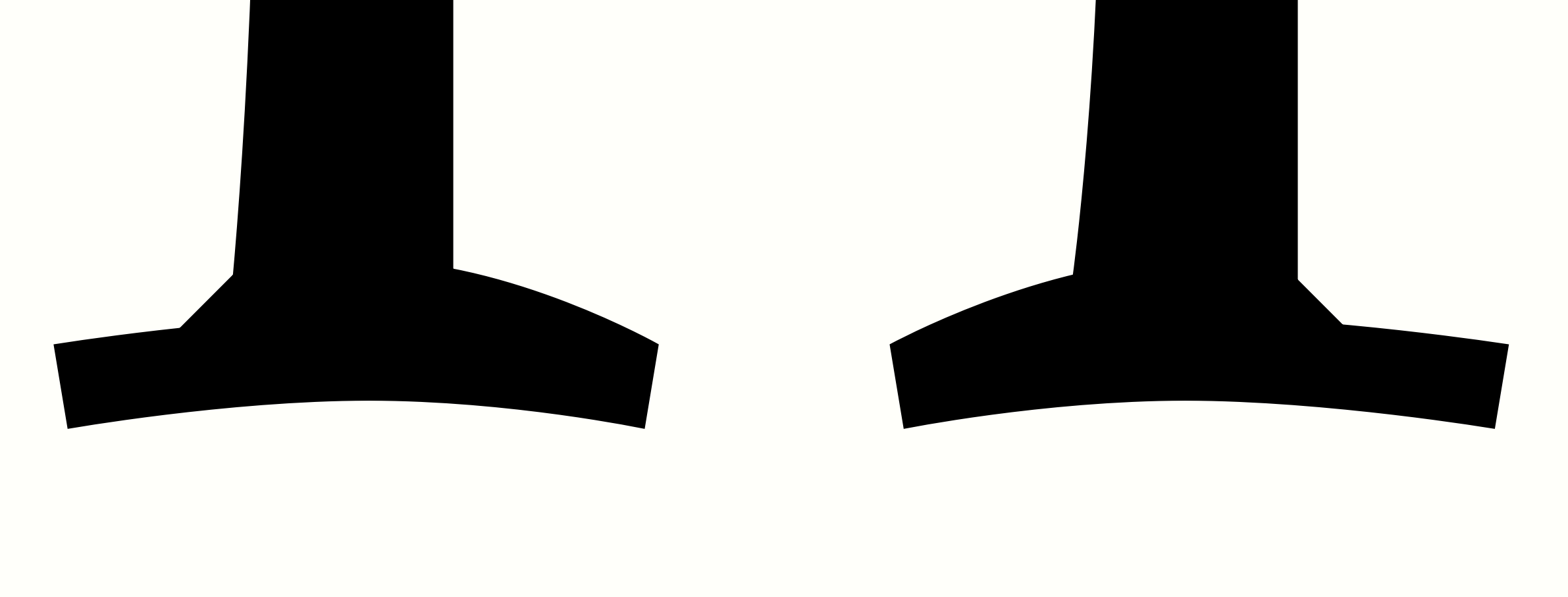
Serifs’ studies in detail.
If the baseline serifs of characters such as i, m or n preserve the double sided serif on both sides of the stem, characters such as b, d, i or l, the top serif is single sided. Looking to reinforce the slant, a modest spur was introduced on top to push the top-right corner even more to the right. Have a closer look at the top-right corner of the stems in the following characters:
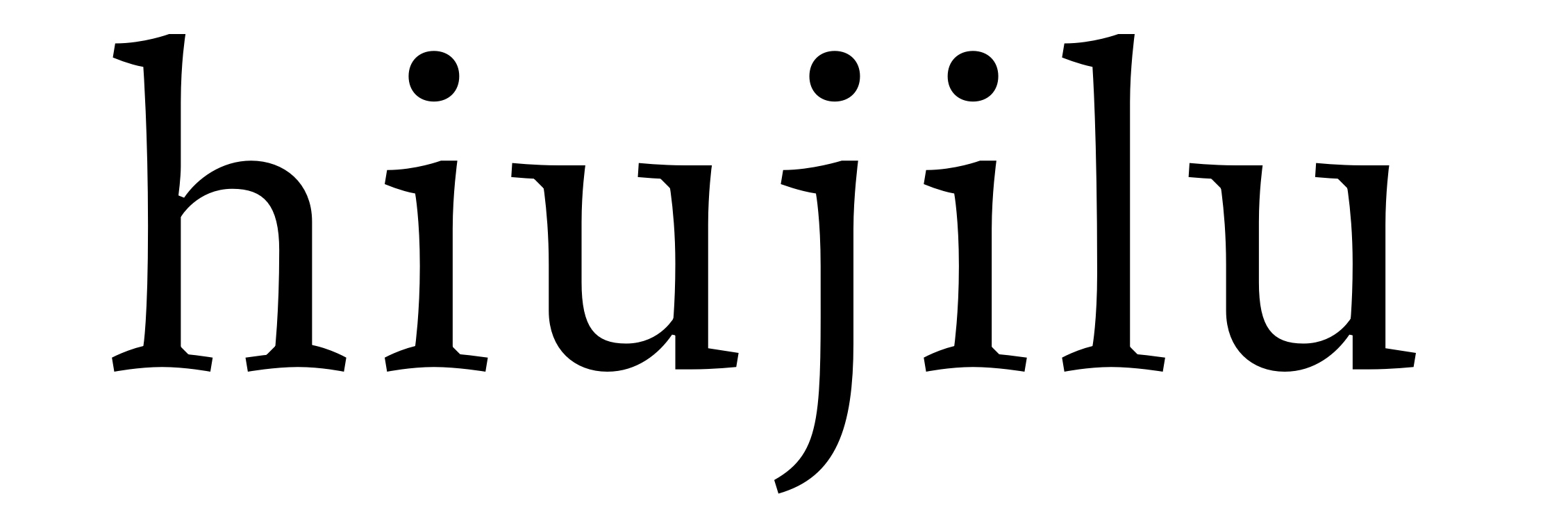
Spurs on the stems top right.
The stems remain vertical and the small spurs emphasise a modest slant. Although, these details are the result of our interpretation of the details, one must keep in mind the need of a verification from printed specimens.